vero beach farmers market
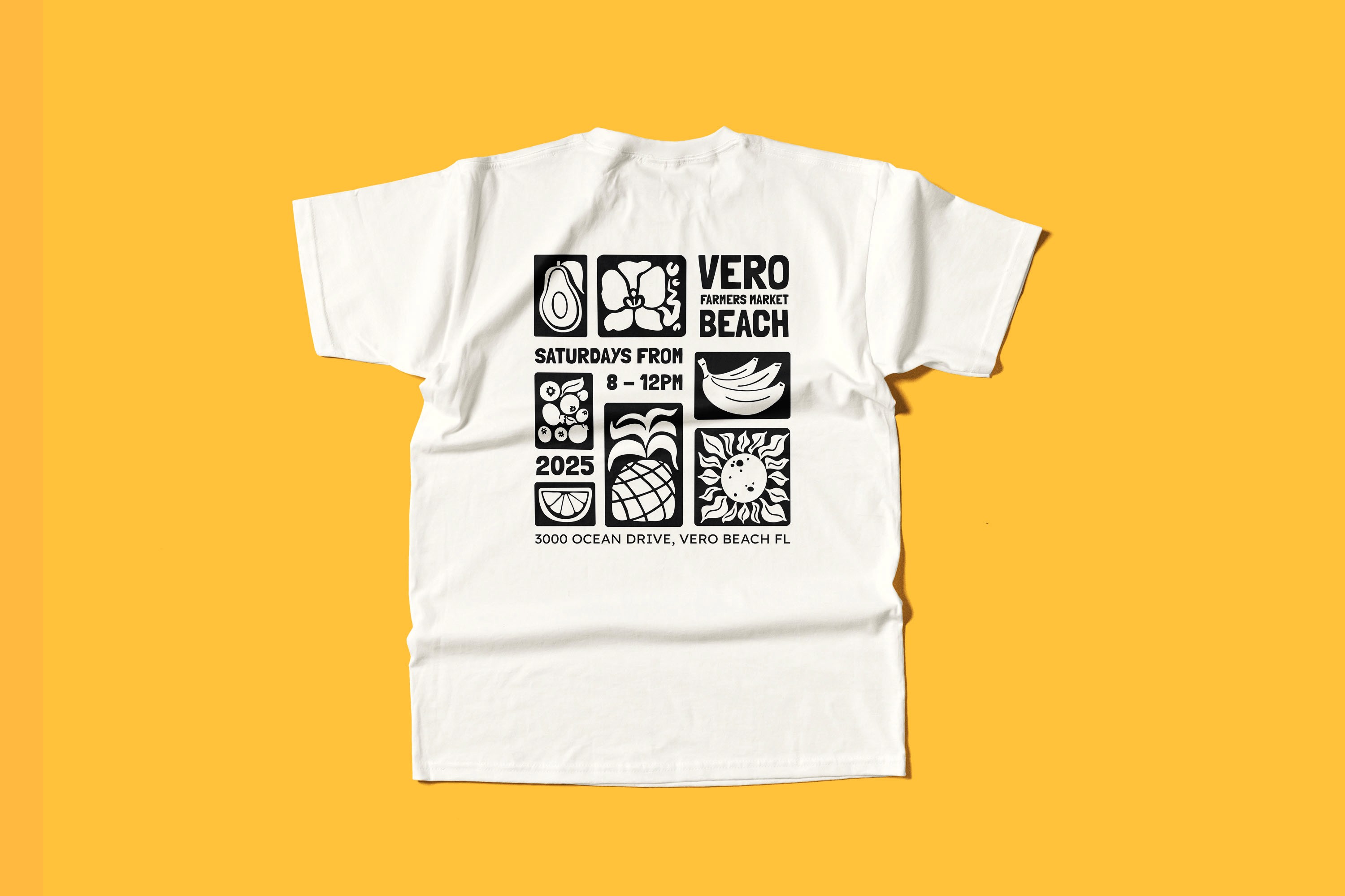
The vero beach farmers market needed a brand that could attract a younger generation without losing its established community. Starting with discovery; brand traits, competitive landscape, and a central "big idea" the identity was built around orchid island's native flora, with a handmade stamp-style orchid logo that honors the market's local roots. A vibrant 10-color tropical palette (with wcag aa-accessible combinations), organic illustration system, and expressive type pairing bring the saturday celebration to life across every touchpoint: signage, a branded event tent, vehicle wrap, social media templates, apparel, and a seasonal calendar. The result is a cohesive, scalable brand system that feels both welcoming and distinctly floridian. Designed from strategy through final asset delivery.
project type
conceptual brand design
client
hoodzpah visual identity cohort